
BLOWEED
Luglio 21, 2021
AMARO MARASSO
Marzo 16, 2022STRADA FERRATA
Italian Whisky? It all starts with beer.
Location: Seregno, Italy
Deliverables: Brand Strategy, Naming, Portfolio Architecture, Brand Identity, Packaging Design, Website, Collaterals

It takes courage, vision and foresight to build a whisky distillery in the industrial heart of northern Italy, but that’s precisely what Strada Ferrata did. The founders Benedetto Cannatelli and Agostino Arioli have a long background in beer and both run successful craft breweries. Whisky indeed begins life as beer, so setting up Strada Ferrata came as a natural step to them.


Whisky is distilled from a fermented grain mash, which is essentially an unhopped beer. Traditionally, the way of brewing this beer has been long overlooked, focusing on alcohol yield rather than taste. But malted barley, yeast and fermentation can invaluably contribute to the flavour of whisky; even the new make – the unaged clear spirit that comes straight off the still – can be a drink of its own, full of character and flavour. Strada Ferrata created six different new make recipes – pure, smoked, peated or flavoured with the best Italian ingredients – alongside a range of single malt whiskies currently maturing in casks.


Our challenge was to help the brand find its place in the market and among consumers. After delving into emerging drink trends and assessing the everchanging competitive landscape, we developed a comprehensive strategy to drive the brand’s growth and communication.

Equipped with a clear vision, it was time to create an equally solid brand identity.
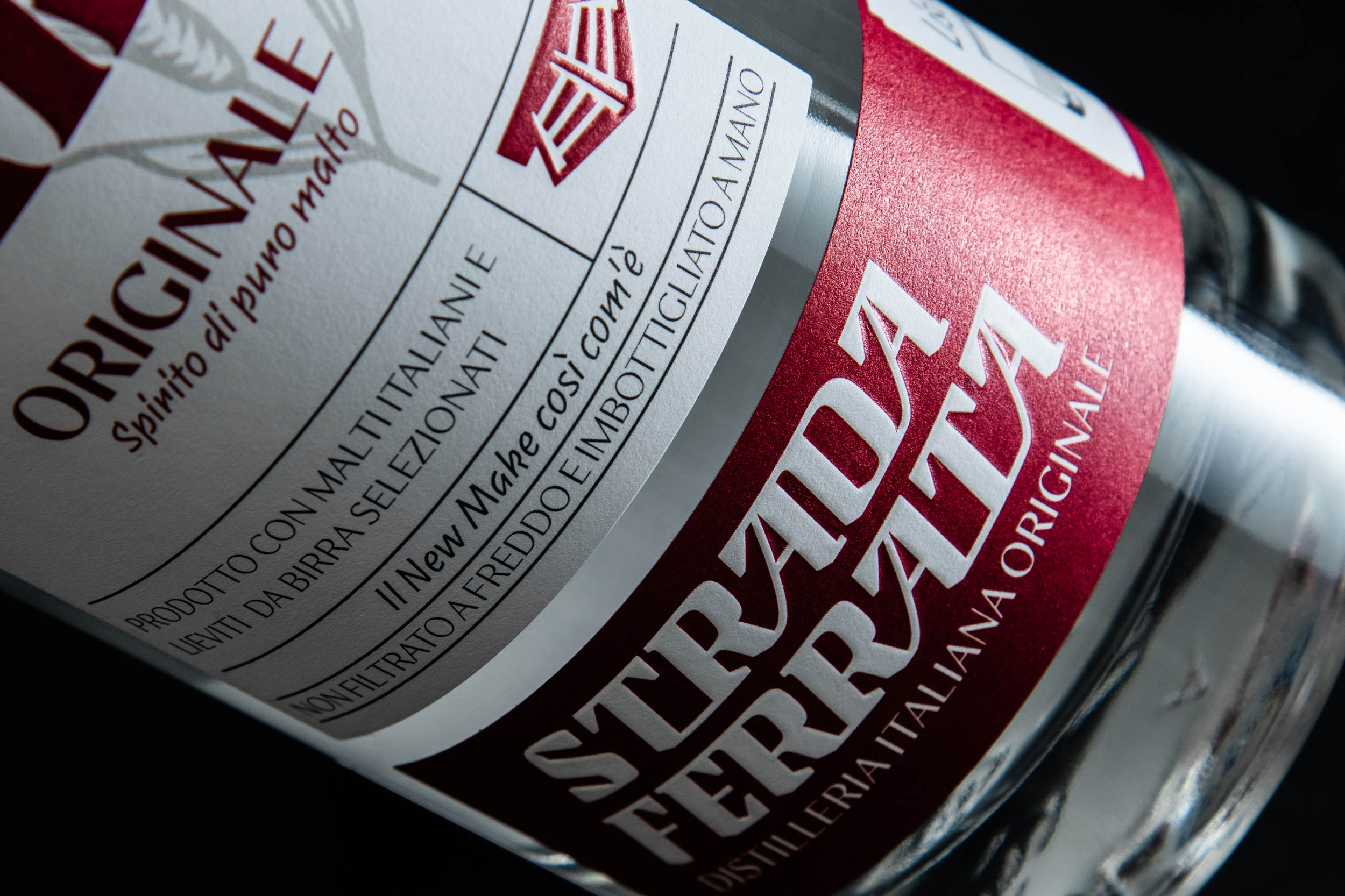
The naming and logo are set to make a real statement: Strada Ferrata is Italian for railroad, and takes inspiration from the old train tracks near the distillery but more importantly refers to the team’s intent of tracing a new route in whisky making. We designed a logo system that reflects all this: a statement lettering suggesting a railway switch, a timeless monogram synthesis, and a cowcatcher logomark that ploughs through the difficult path the brand is setting.


The New Make packaging system consists of a set of three labels -front, wrap around bottom strip and neck – designed for clear navigation throughout the range; it informs consumers about an innovative spirit that’s entirely new to the Italian market. The radical differences between the products are highlighted by botanical illustrations and hero colours.

Beyond packaging, we designed a website and online shop that engage with users, showing them the journey of Strada Ferrata and their radical approach to whisky. We also worked on a broad family of visual assets and materials: icons, infographics, social media templates, tasting notes, glasses, bar coasters, merchandising.


Whisky won’t be ready until 2024, but product development and packaging design is already under way.


Product photography: Hubmira.

