
LORD CHAMBRAY
Aprile 20, 2021
BREWFIST
Aprile 20, 2021ORBIT BEERS
Revealing Orbit’s music heritage with a new refreshing identity
Location: London, UK
Deliverables: Brand Identity, Packaging Design, Collaterals, Merchandise
Brewing in London has changed dramatically in recent years, with now over a hundred breweries of all shapes and sizes scattered around the city. Based under a railway arch in Walworth, South London, Orbit was born in 2014 out of a fascination for European brewing heritage and a deep passion for all things music and vinyls. Having struggled to convey their story with their original visual identity, we were tasked with a full rebrand to help them tackle the increasingly aggressive local market.

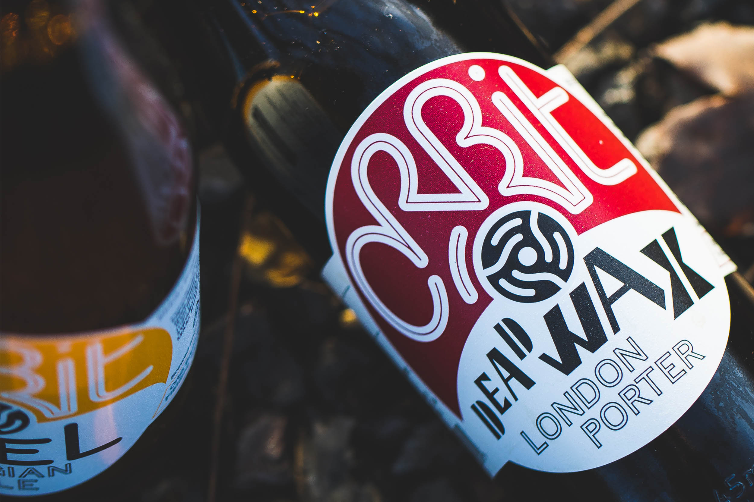
We turned our attention to the spindle adapter, a strong visual asset that already resonated with customers, and redesigned it with a more proprietary shape. It proved the leading element around which the new identity should revolve. The new logo shifted the weight towards the word Orbit, redesigned as a continuous stroke inspired by a soundwave.


The label was radically overhauled and made highly distinctive with a die-cut shape inspired by the look of vinyl 45s centre labels. The beers had names taken from bands, record labels or music heroes, so we made them more distinctive through custom typography and a witty infographic that highlights the unique character of each beer. From there we went on to work on a wide range of collateral materials, from shipping boxes to glassware, POS items to merchandise.


After consolidating their core range of beers, the brewery expanded their portfolio launching two new ranges. White Label Series are one-off, limited beers driven by creativity and experimentation, designed after the more synthetic and monochrome look of white label records. Digger’s Series are vintage, collectible and barrel-aged beers where the packaging is enriched by foil blocks, wax seals and collar tags.

In 2021 the brewery will substantially expand capacity and open a brand new taproom across the road from their original double railway arch.


