
ORBIT BEERS
Aprile 20, 2021
LITTLE SWIFT
Aprile 21, 2021BREWFIST
Evolving the core while staying true to the brand
Location: Codogno, Italy
Deliverables: Packaging Design
Brewfist is a second-generation craft brewery in northern Italy now among the top ten independent producers in the country. Since the beginning, they committed to bold flavours and a no-compromise approach to do things, which reflects in their brand identity and vast packaging system. 2020 marked the brewery’s 10th anniversary and, in typical Brewfist fashion, they wanted to celebrate big! Cans are rapidly catching up and becoming the container of choice for Italian craft beer drinkers, so Brewfist saw a unique opportunity to tap into this emerging market.
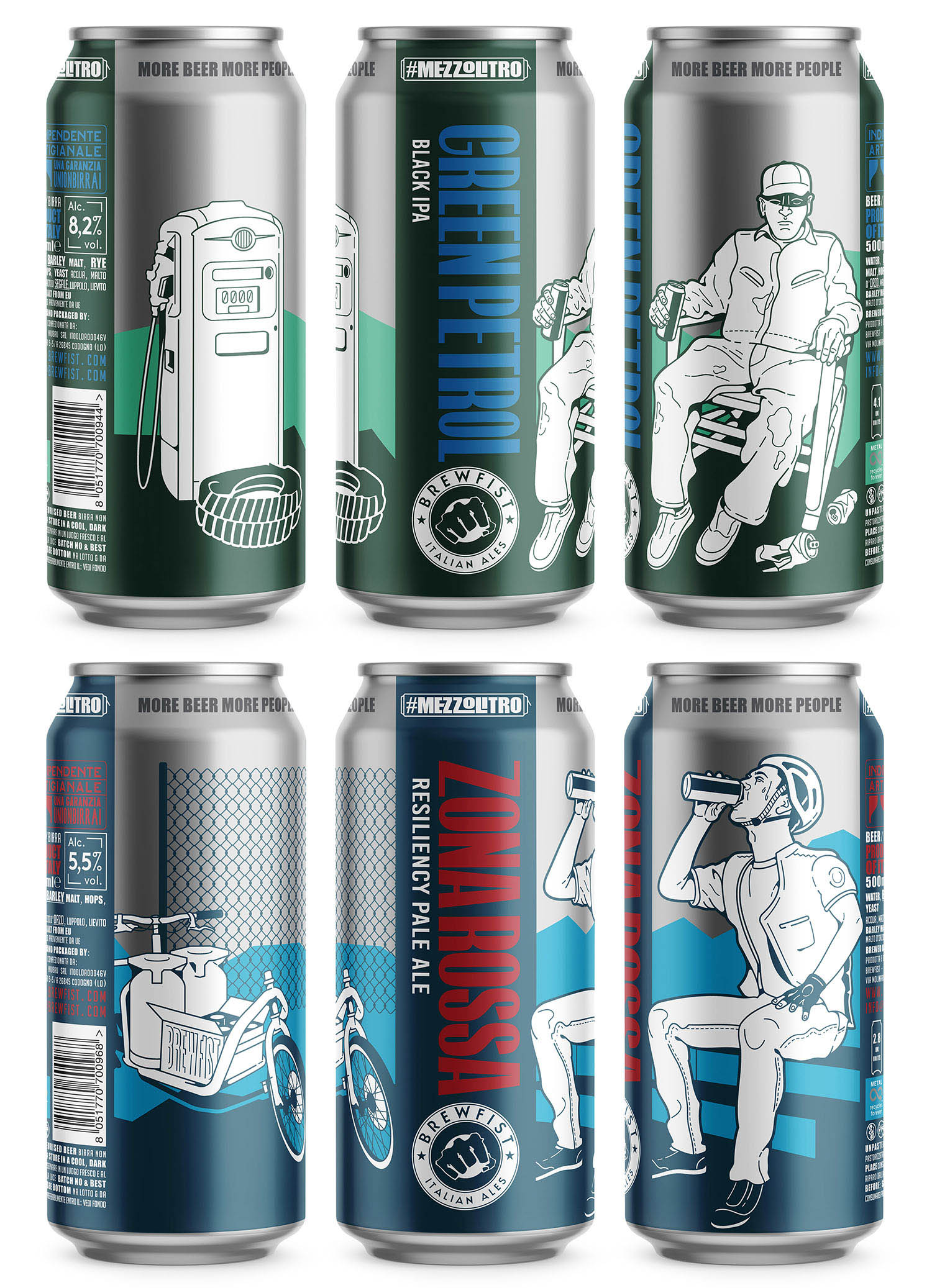
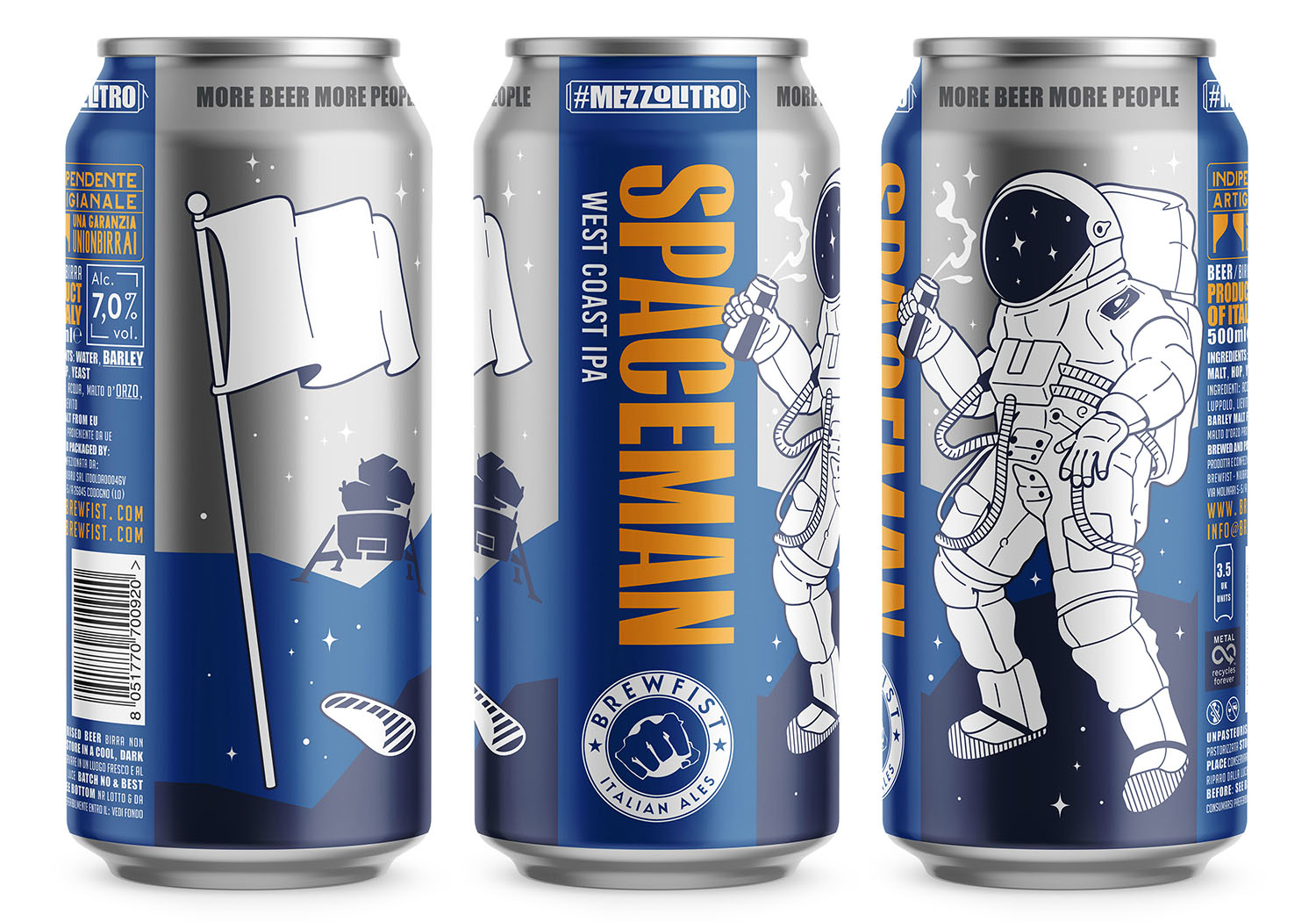
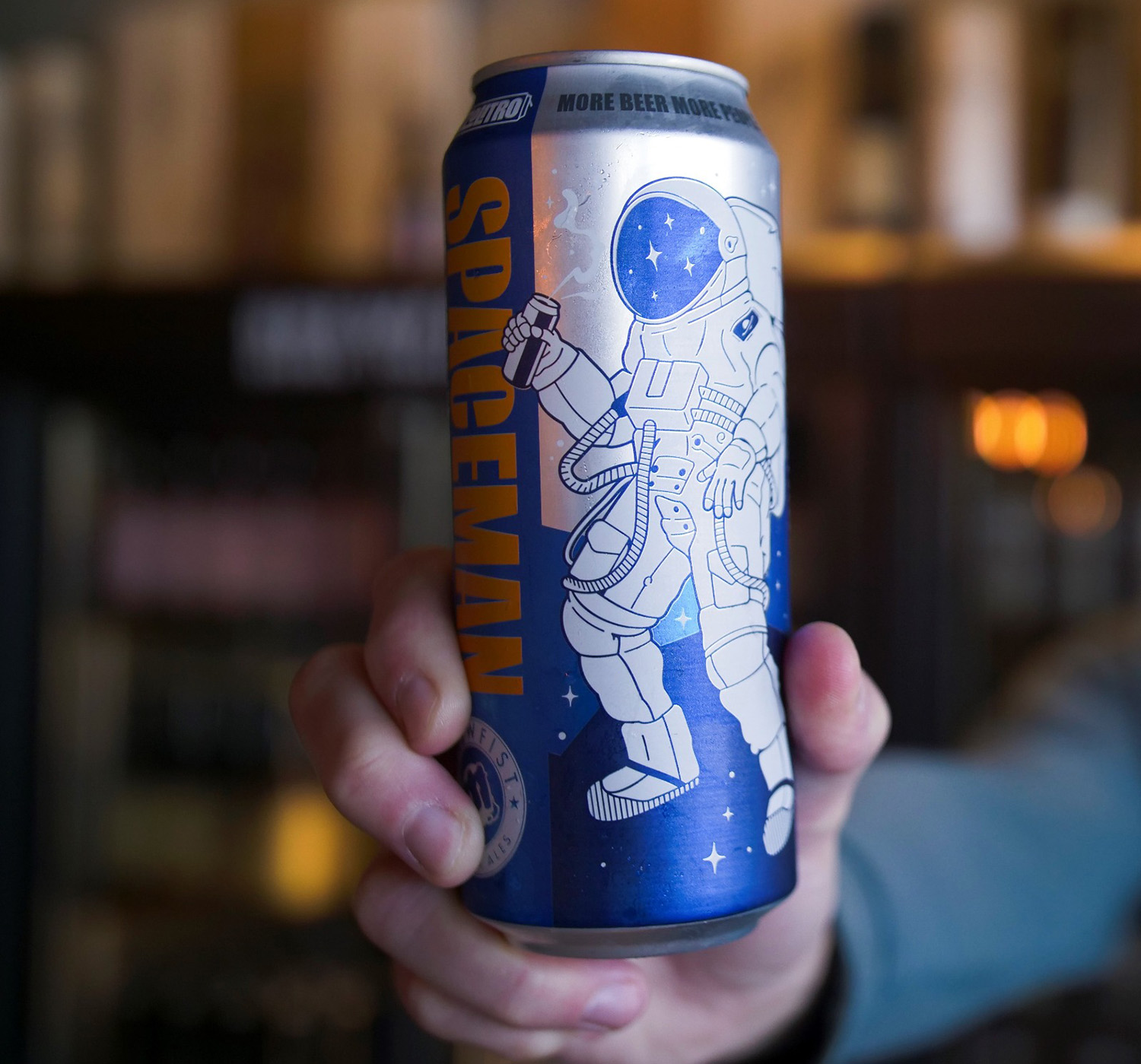
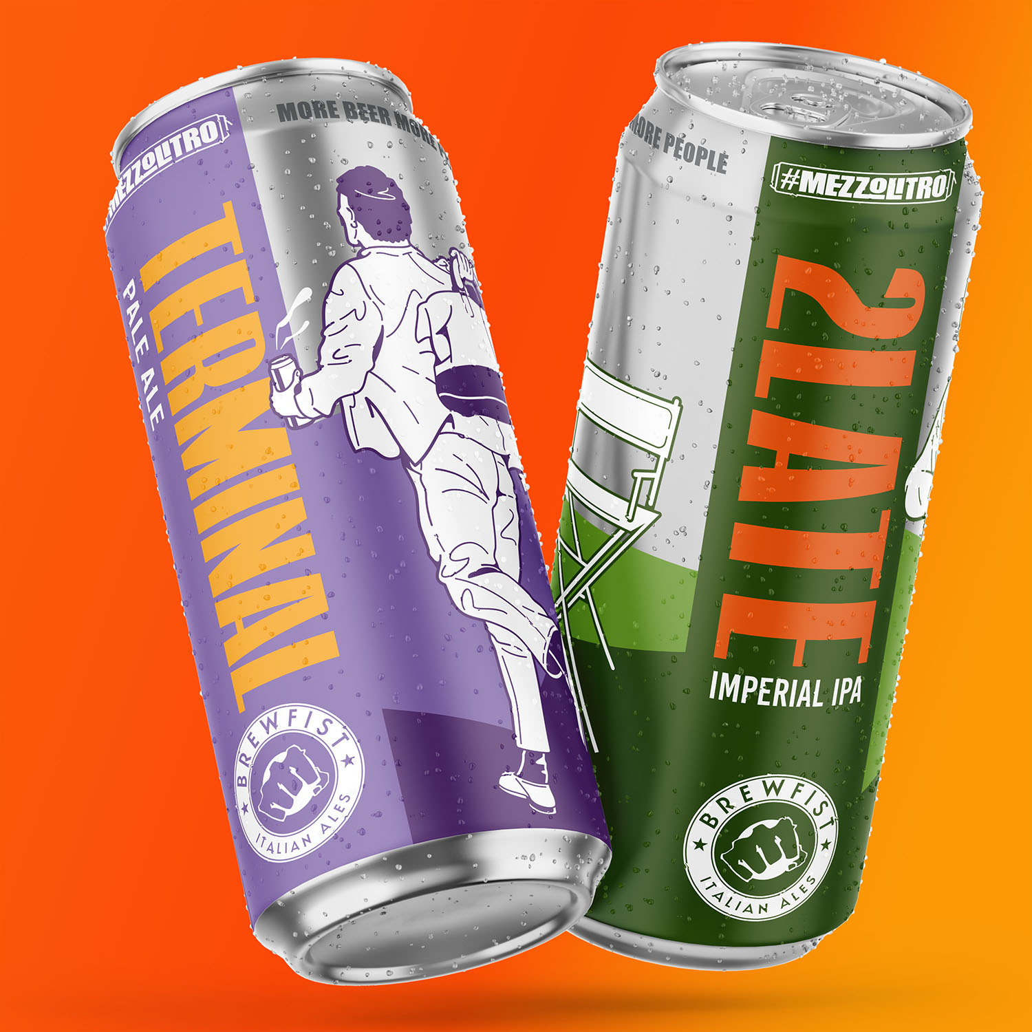
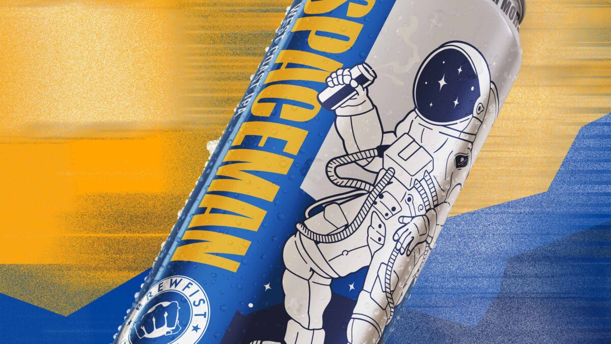
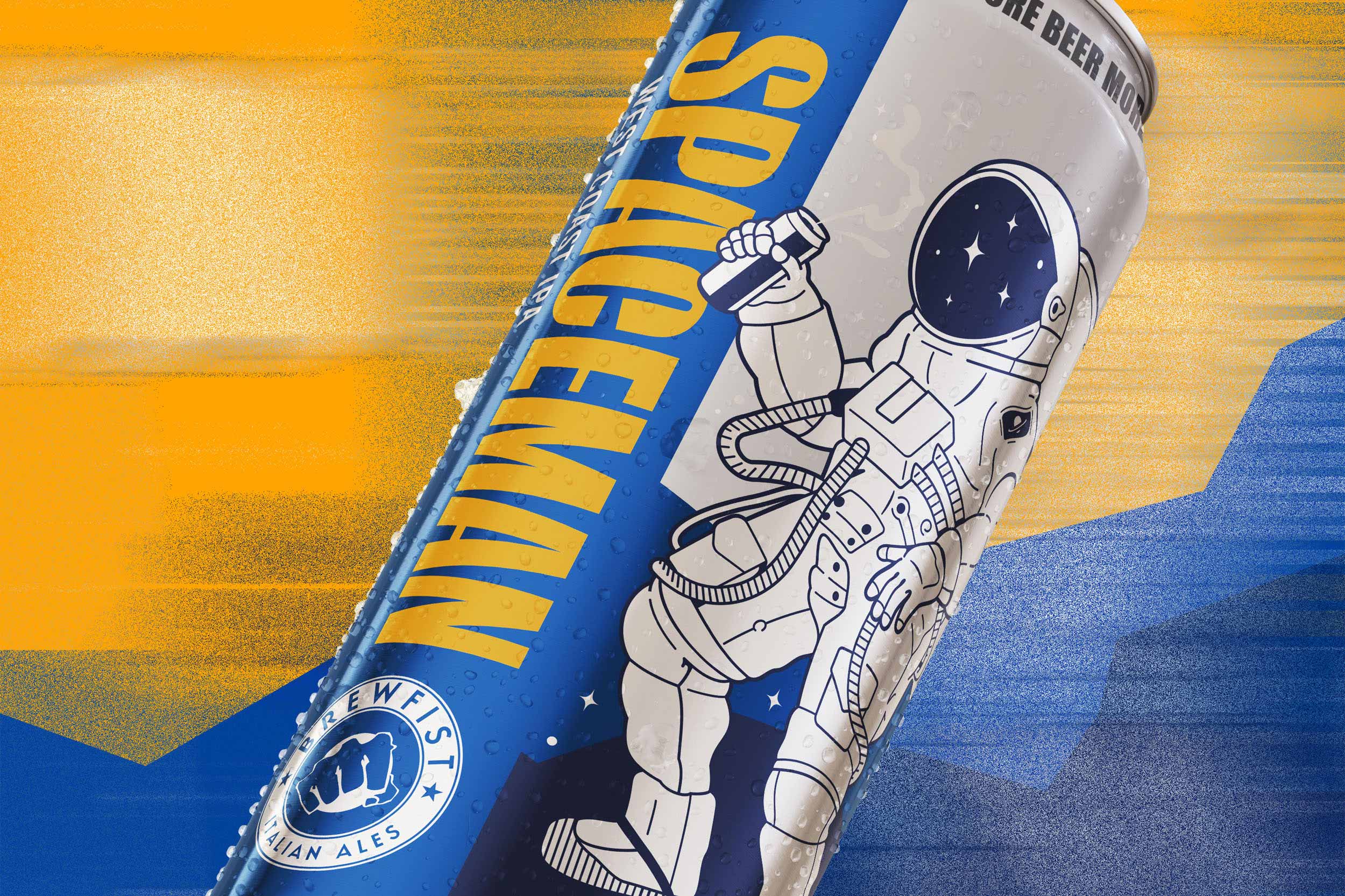
The “core range” product line we designed for them in 2016 was identified as one that could really suit the can format. It’s essential to note that bottles will continue to be sold alongside cans, so the new branding is an evolution of the original designs instead of a revolution. We kept the original layout and inspiration for each illustration but evolved the hero characters with revisited actions and settings, toying with actual cans included in the illustrations.
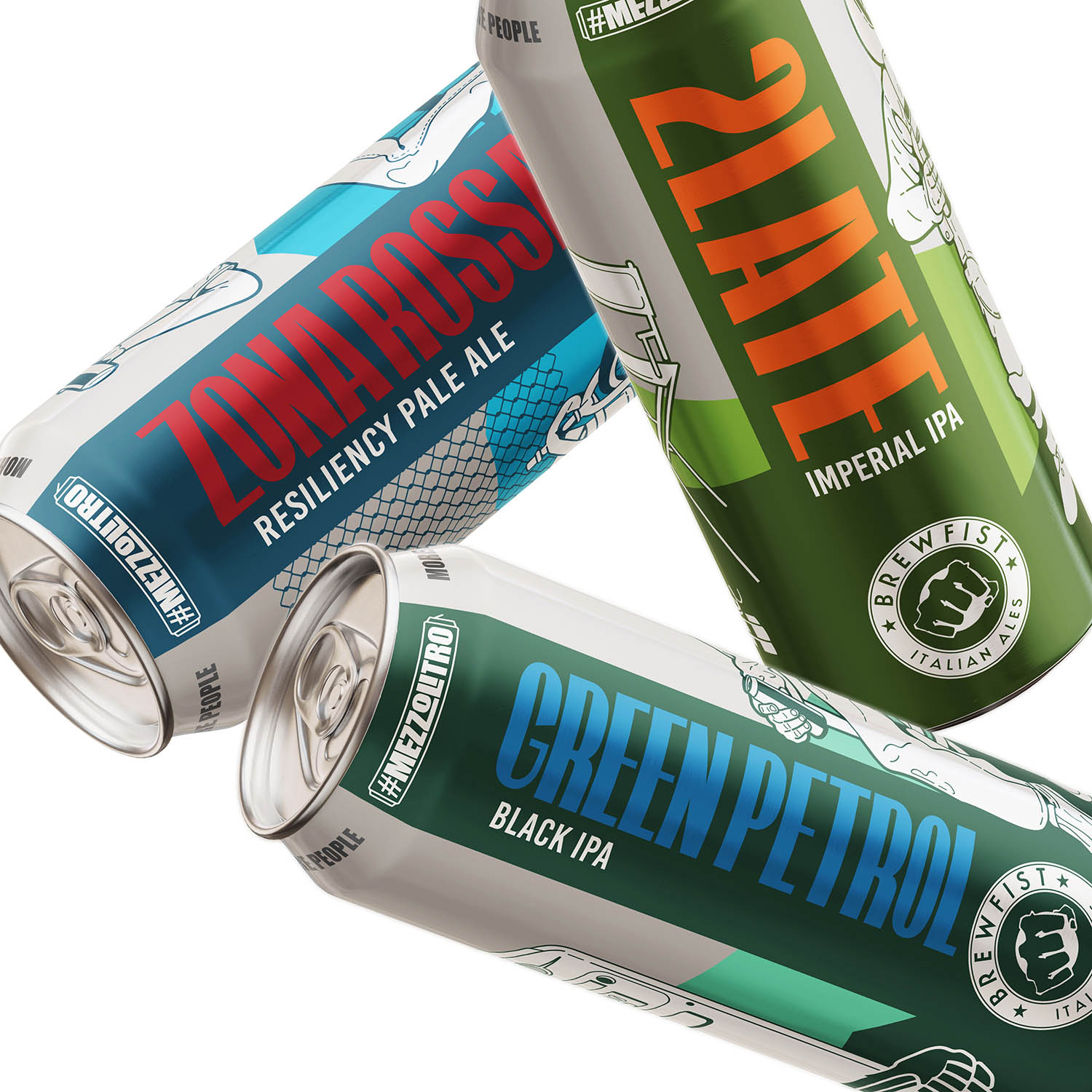
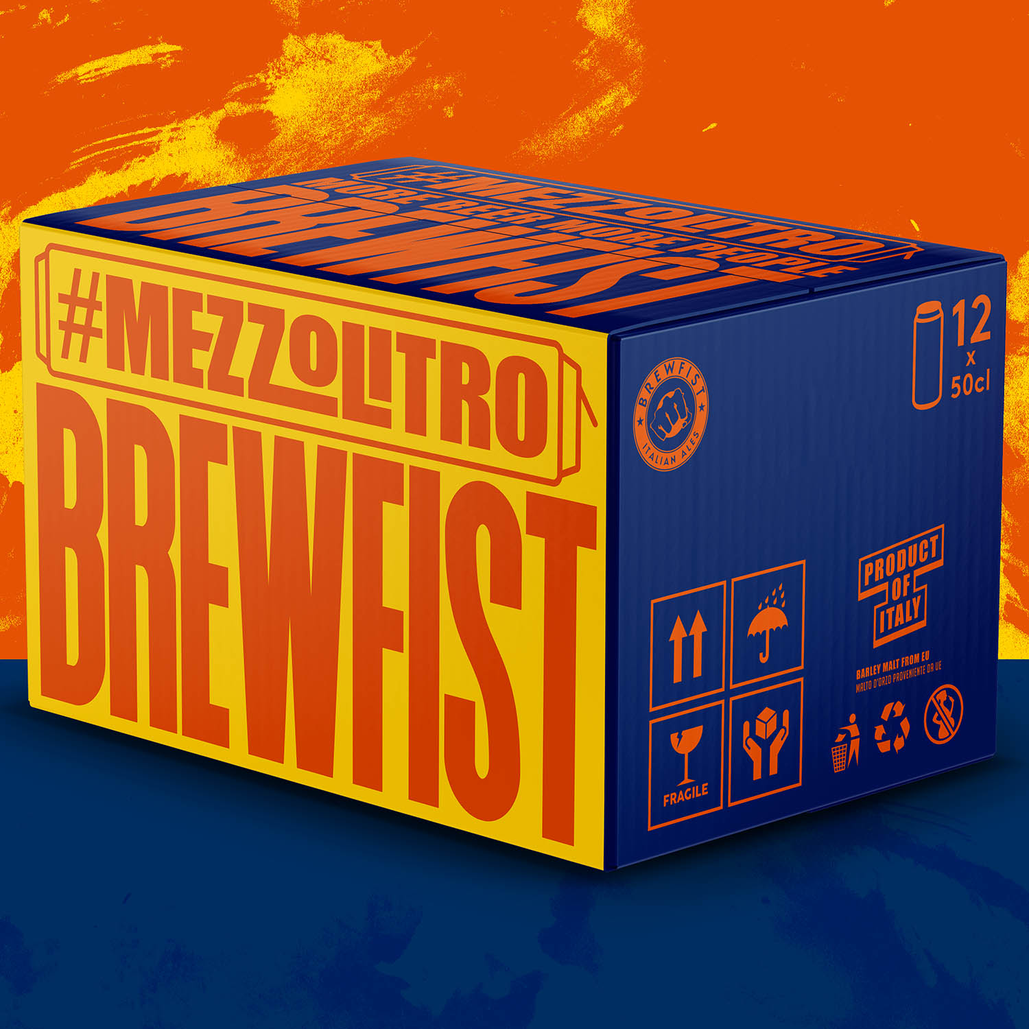
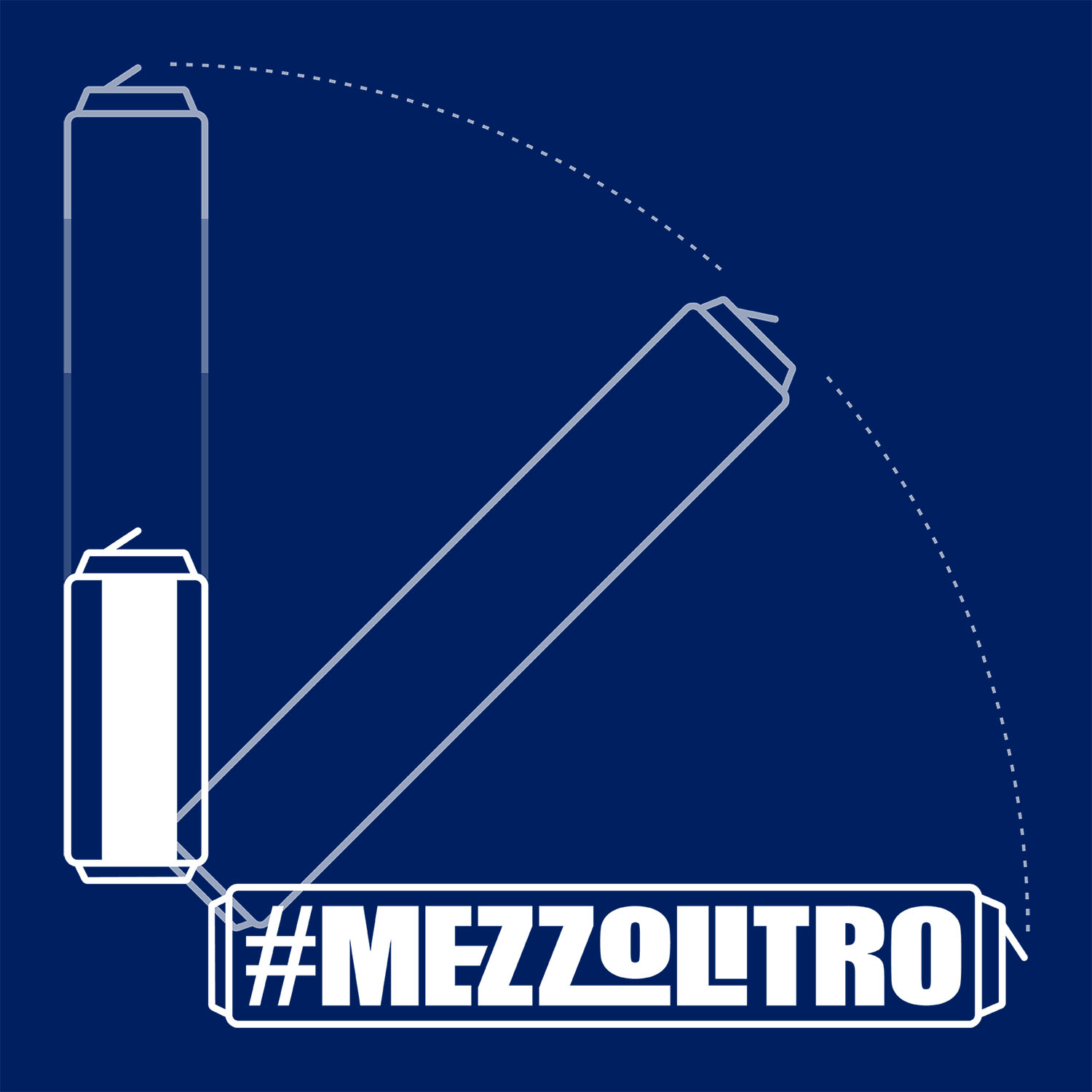
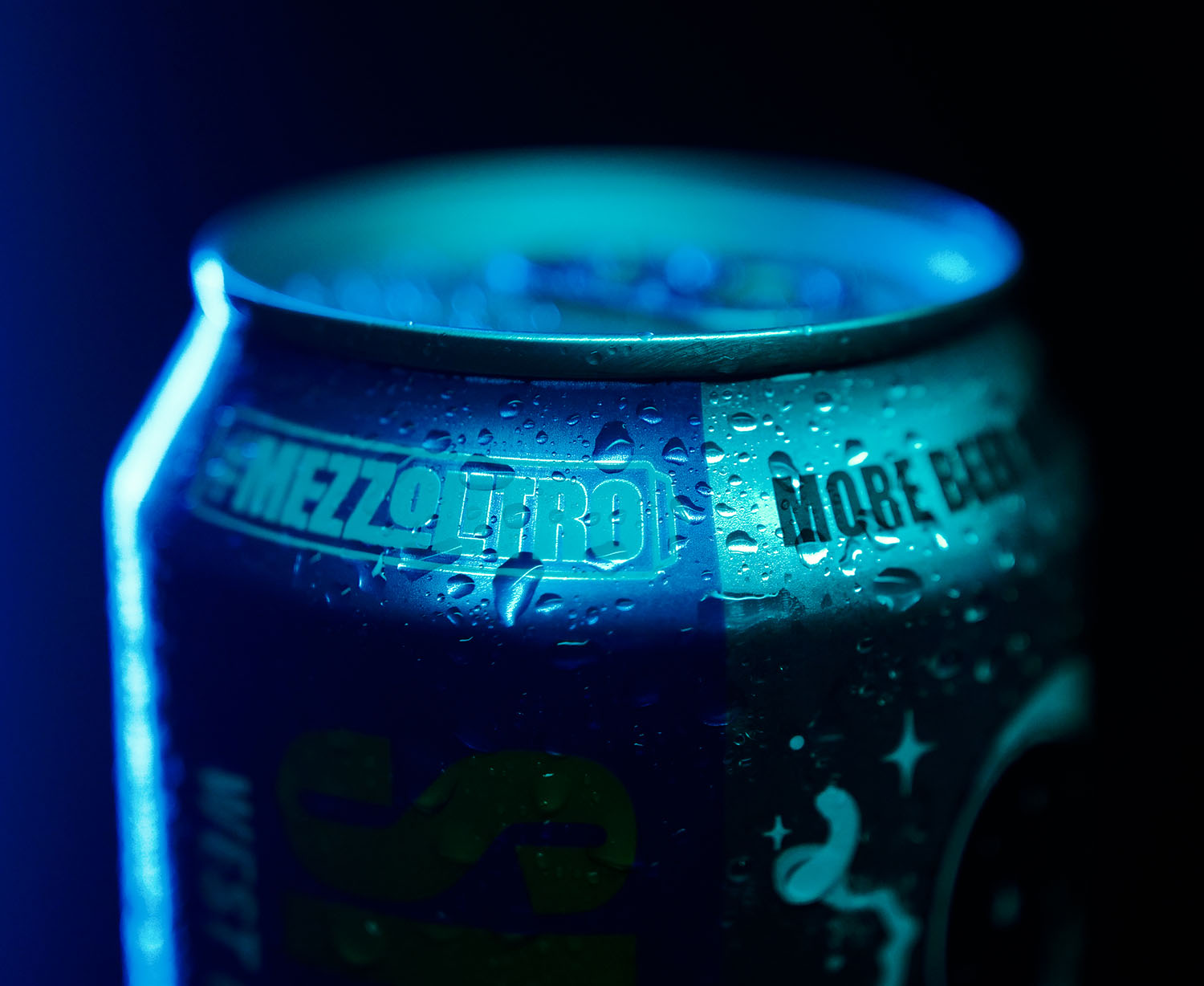
The exposed silver of the aluminium can was something we wanted to incorporate in the colour scheme, and it’s become a key asset of all the backgrounds. The most common can formats for craft beer in the domestic market are 330/400ml, so it was a very Brewfist move to go for 500ml. We created the tagline #mezzolitro (half a litre!) to signify the uncommon size of the can and better define their entire range of canned beers. The new tagline now sits on the neck of the can alongside the brewery’s old slogan “more beer more people”.

Typography and lettering were slimmed and improved to better suit the can’s taller profile. The aluminium cans are finished with an all-over matt varnish.
