
CAINA
Giugno 24, 2021
STRADA FERRATA
Settembre 24, 2021BLOWEED
An empowering CBD brand that encourages making time for one’s self
Location: Piacenza, Italy
Deliverables: Brand Identity, Packaging Design
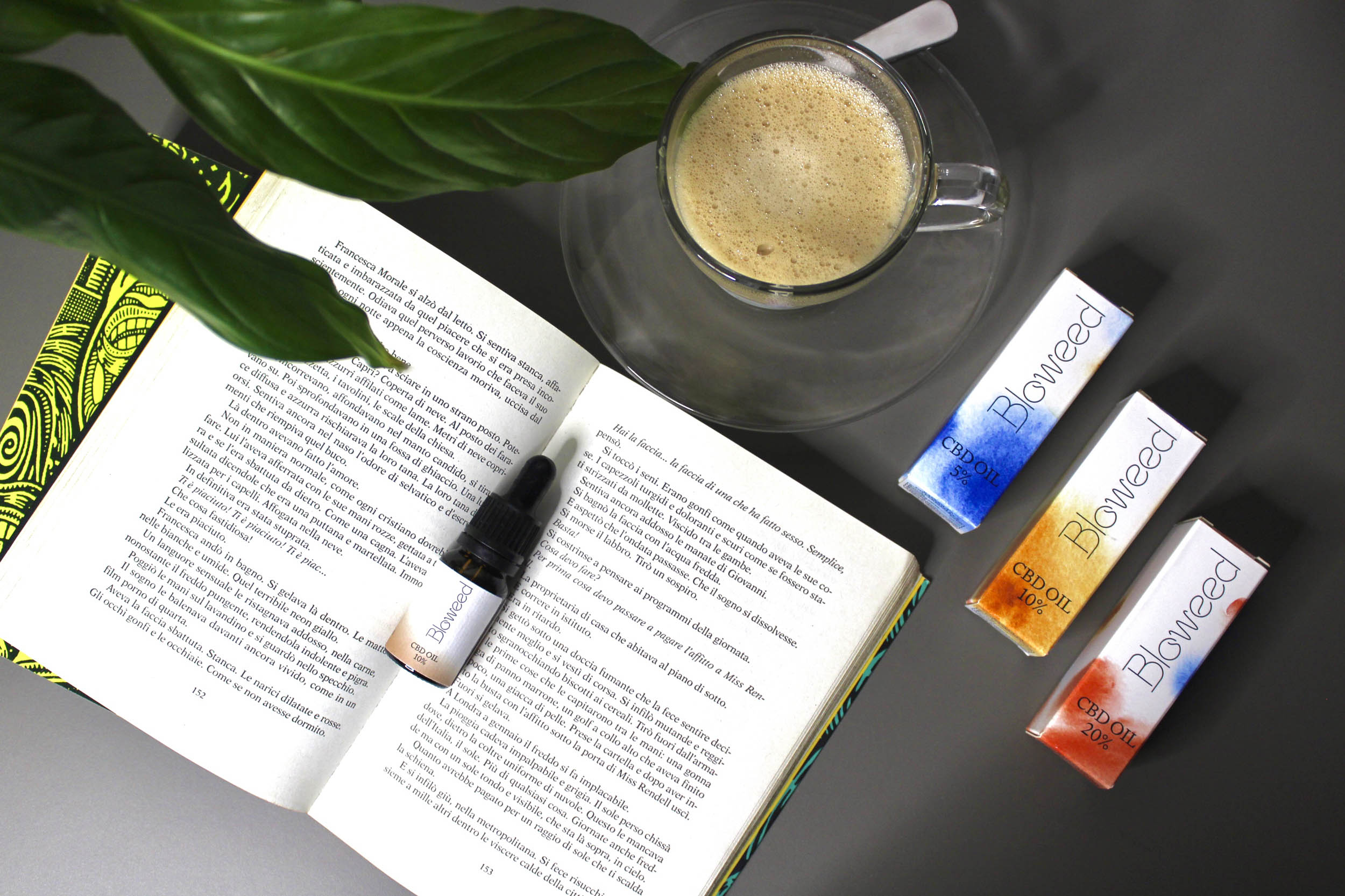
The CBD category is gaining momentum all around the world. In an age of hyper connectivity and social fatigue, CBD products can help you refocus on yourself and find time for things that matter, enhancing mindfulness and encouraging relaxation.
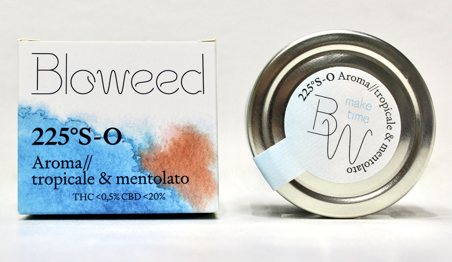
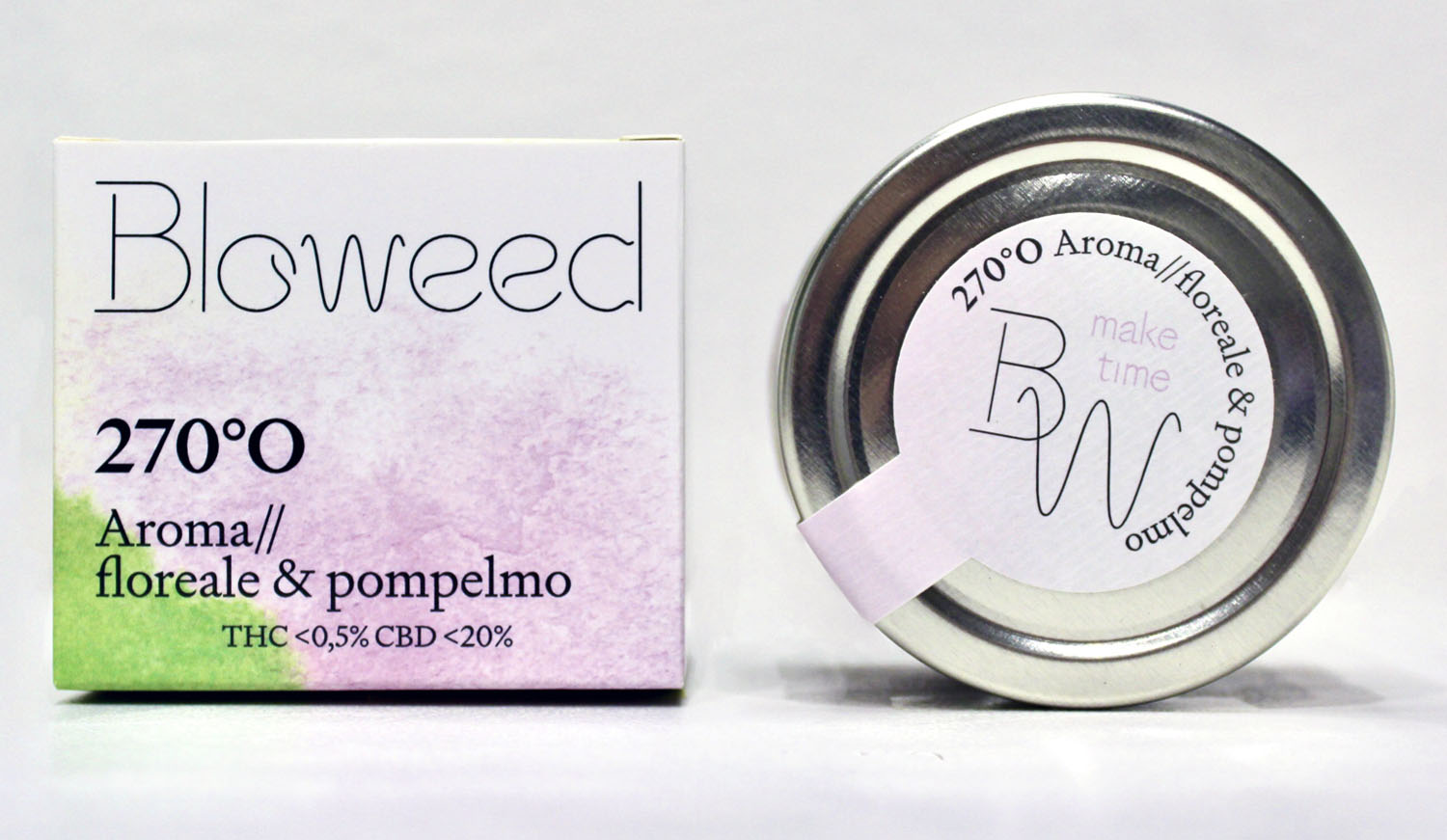
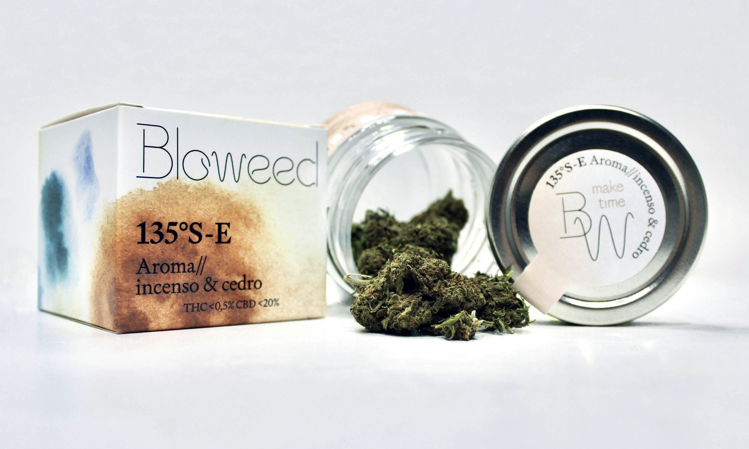
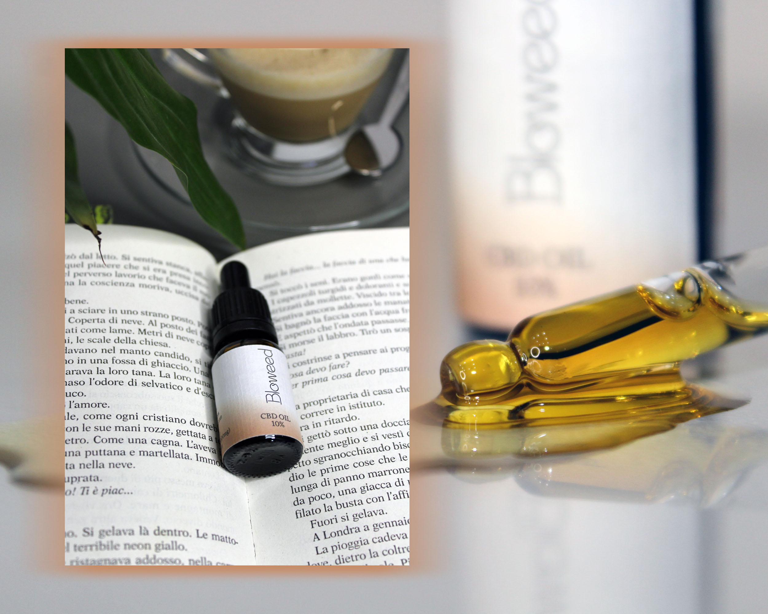
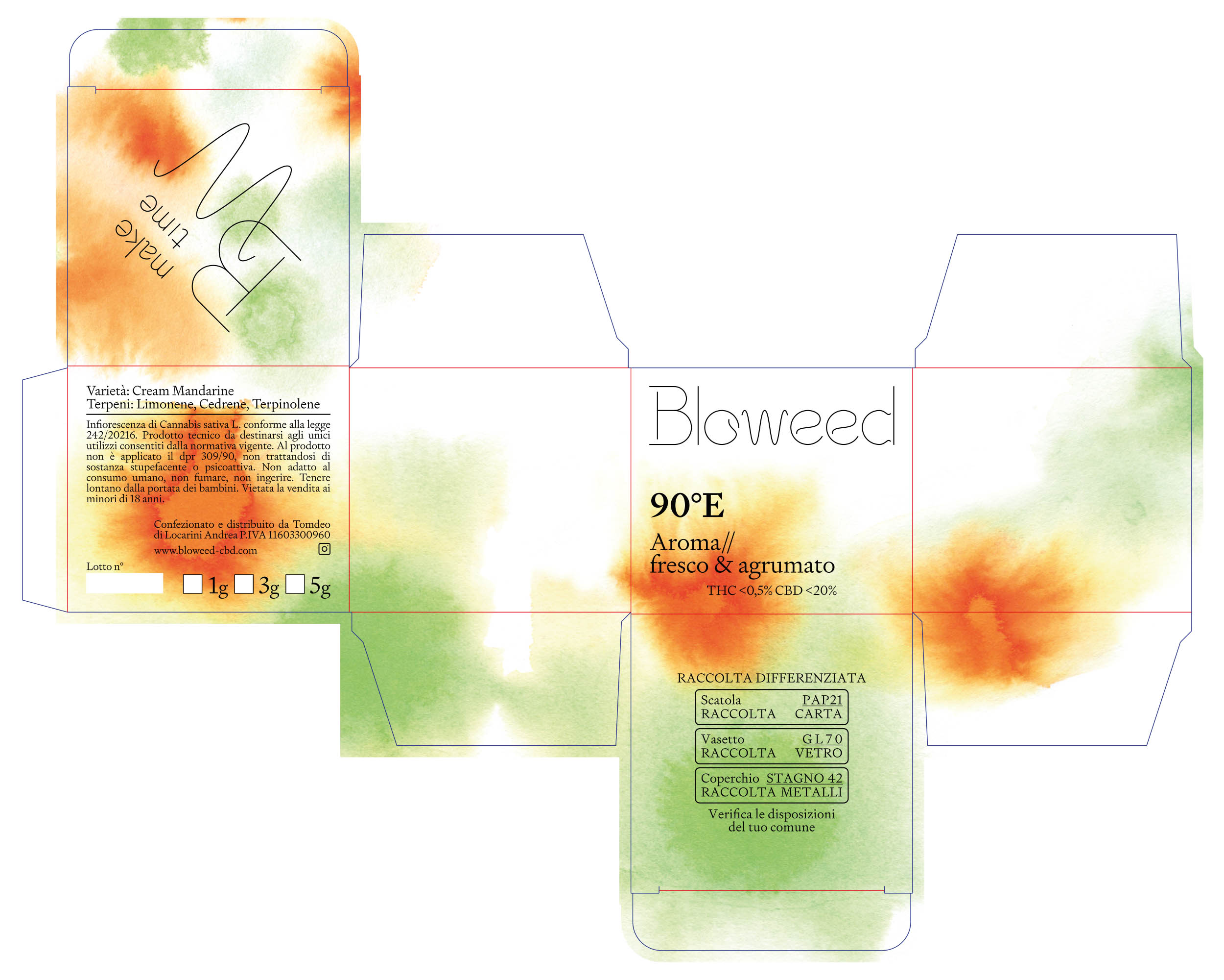
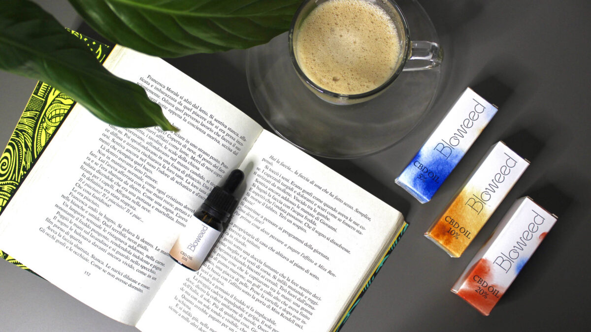
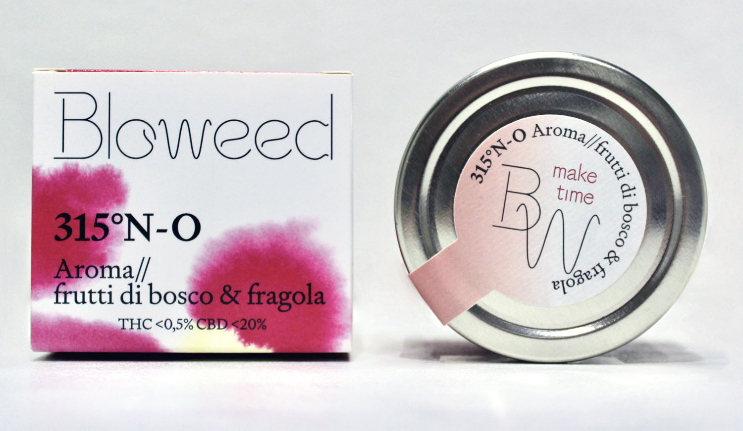
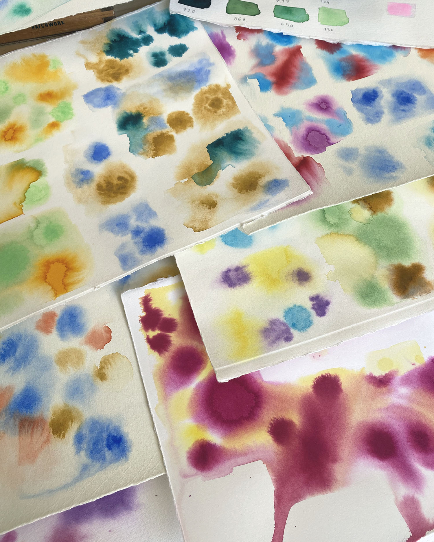
Bloweed borrows the visual language of better-for-you beverages and all-natural beauty products to deliver a broad range of oils and flowers with a highly captivating packaging. The ethereal blurred patterns on the boxes were drawn freehand with Ecoline watercolour inks and designed with a rich colour palette. The hero colour of each pack then translates onto the label of the bottle or jar. Product naming is a reference to the direction of winds and is inspired by the aromas of the flowers and oils.

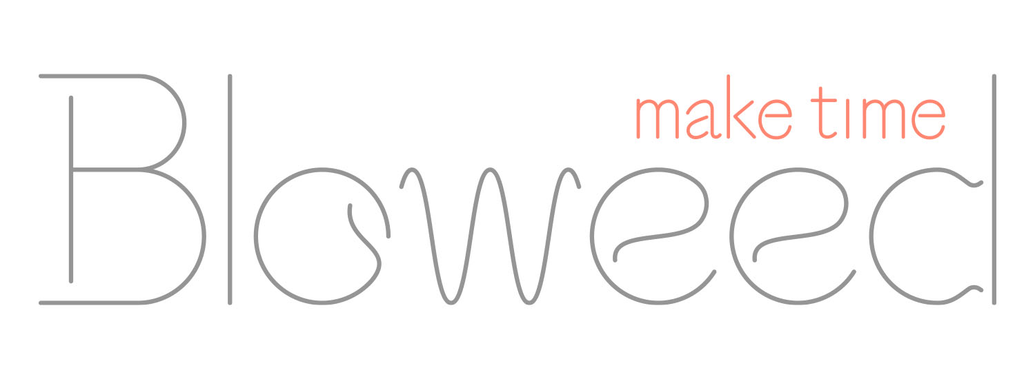
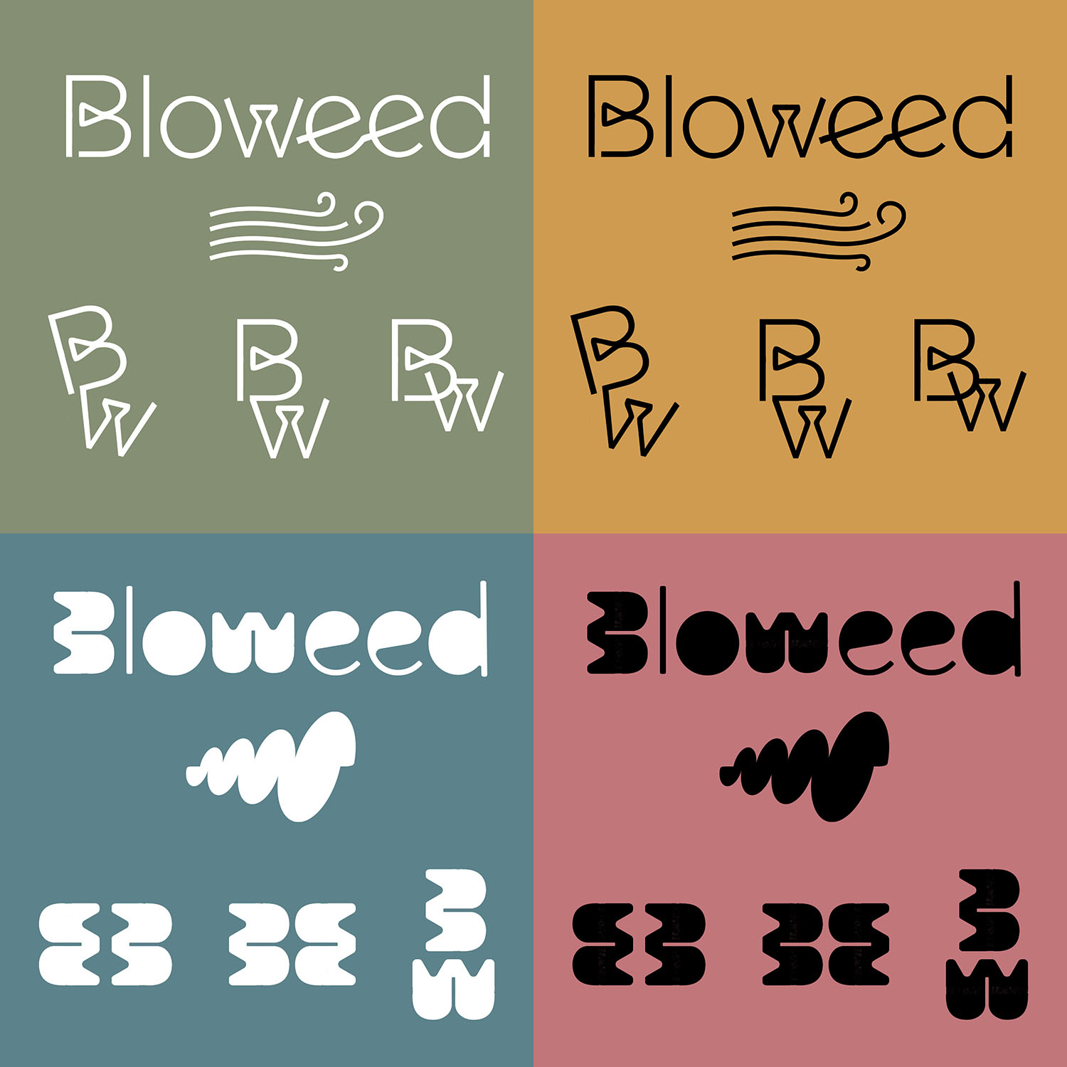
Bloweed’s logo and monogram enhance the pure and positive brand personality, whereas the tagline Make Time stresses the importance of nurturing your body and mind. The curvy and material typeface Signifier by New Zealand type foundry Klim includes beautifully statuesque numbers and symbols that add distinctive character to the packaging.
