
VECCHIA LODI
Marzo 11, 2021
ARGO
Aprile 19, 2021ALDER
Contrasting colours and flexible system for a dynamic portfolio
Location: Seregno, Italy
Deliverables: Brand Identity, Packaging Design
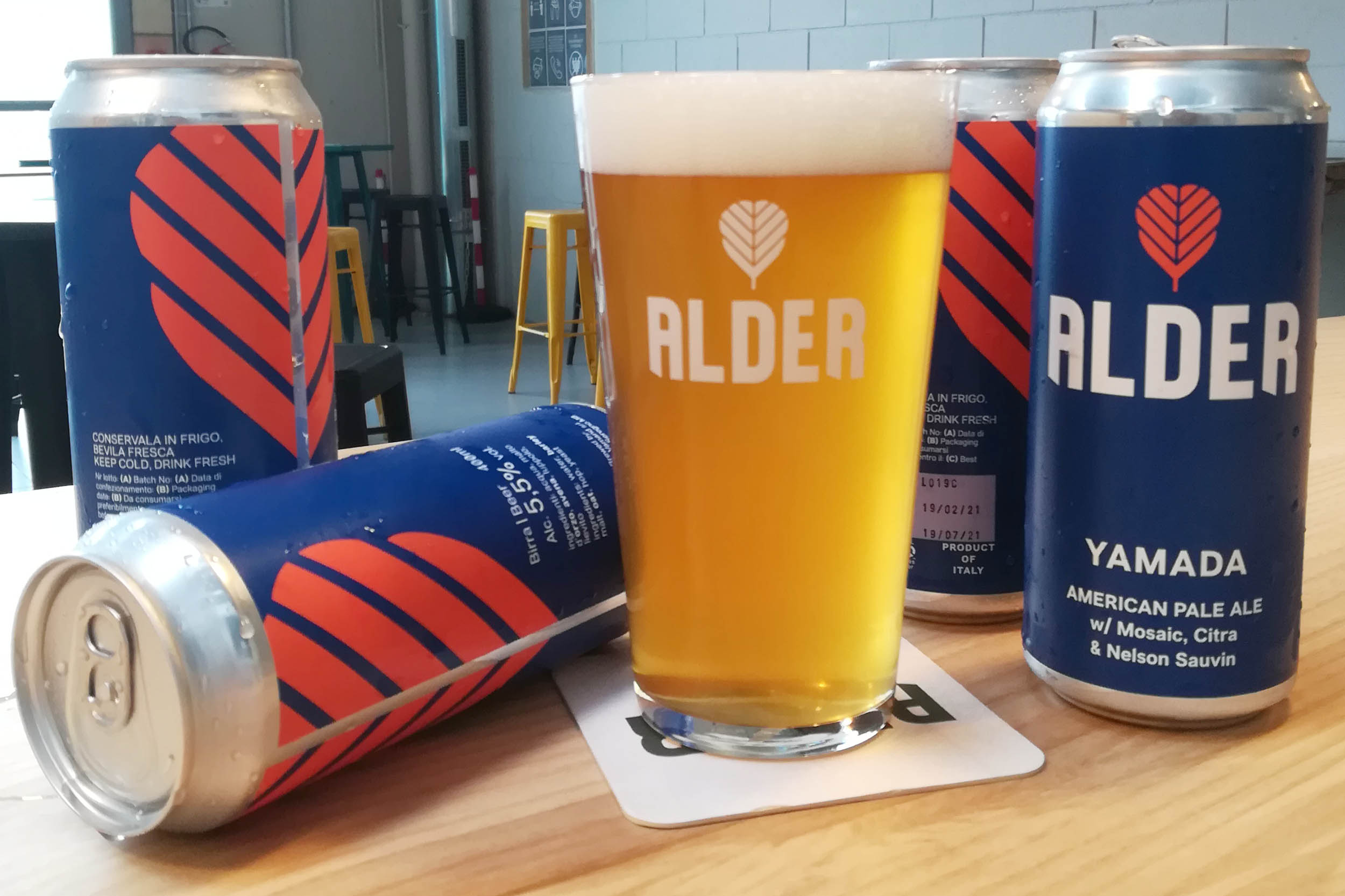
Brewer Marco Valeriani has been among the hottest names in Italian craft brewing over the past few years. A long experience in some of northern Italy’s best breweries earned him the Birraio Dell’Anno (Brewer Of The Year) award twice, but his lifetime dream was always opening his own family brewery. After a long search he finally settled for his hometown of Seregno in leafy Brianza, a prosperous area wedged between Milan and the Alps. The alder tree is a common feature of the local landscape; curiously, alder wood doesn’t rot when waterlogged, instead turning harder and stronger. This outstanding resiliency offered the chance for the perfect brand name.
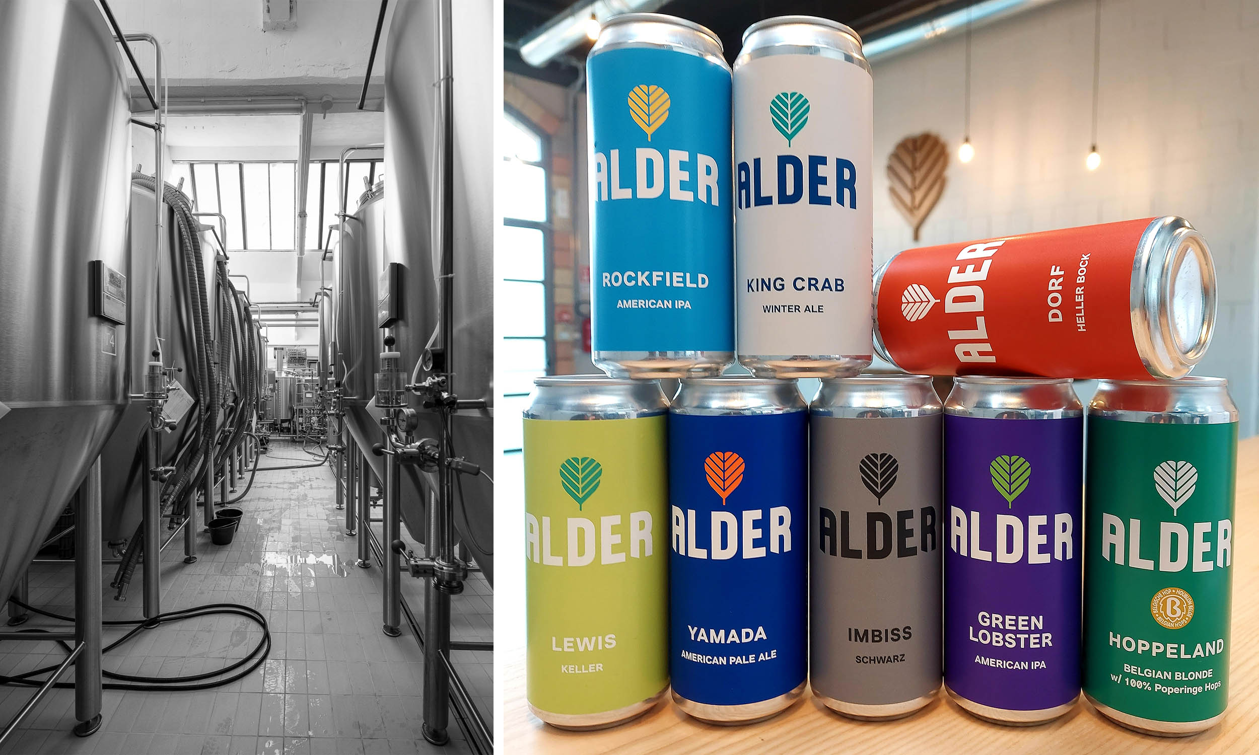
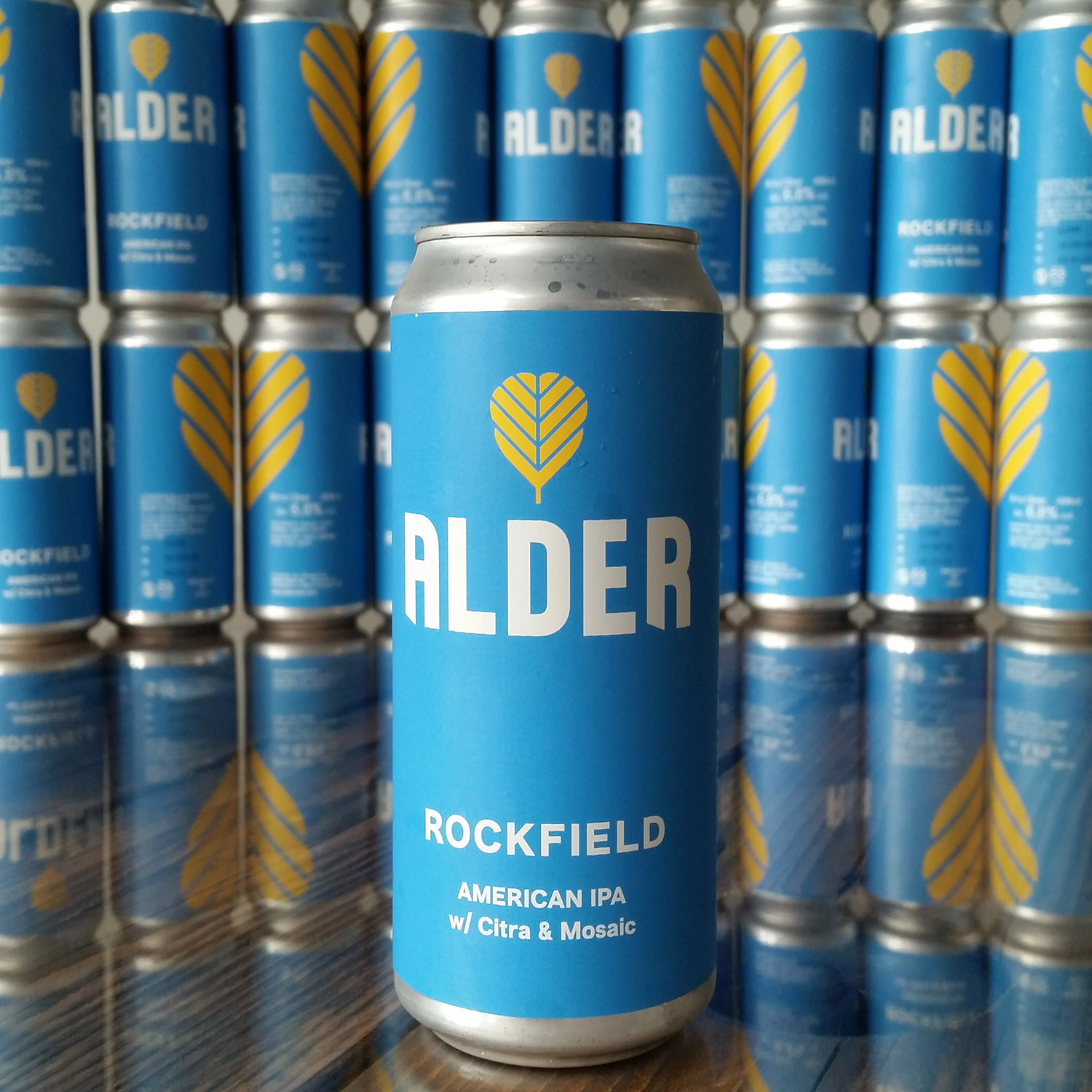
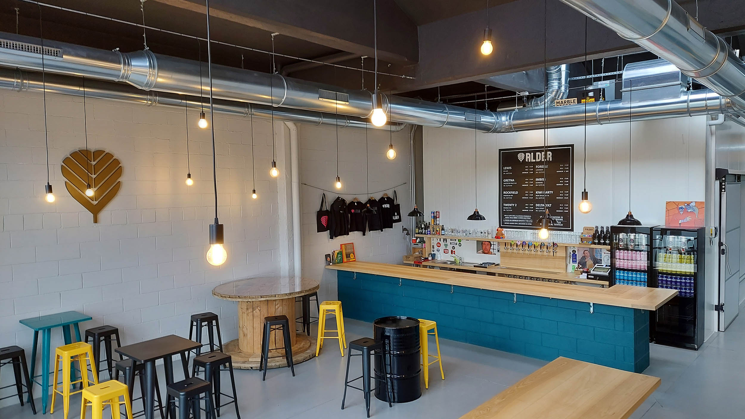
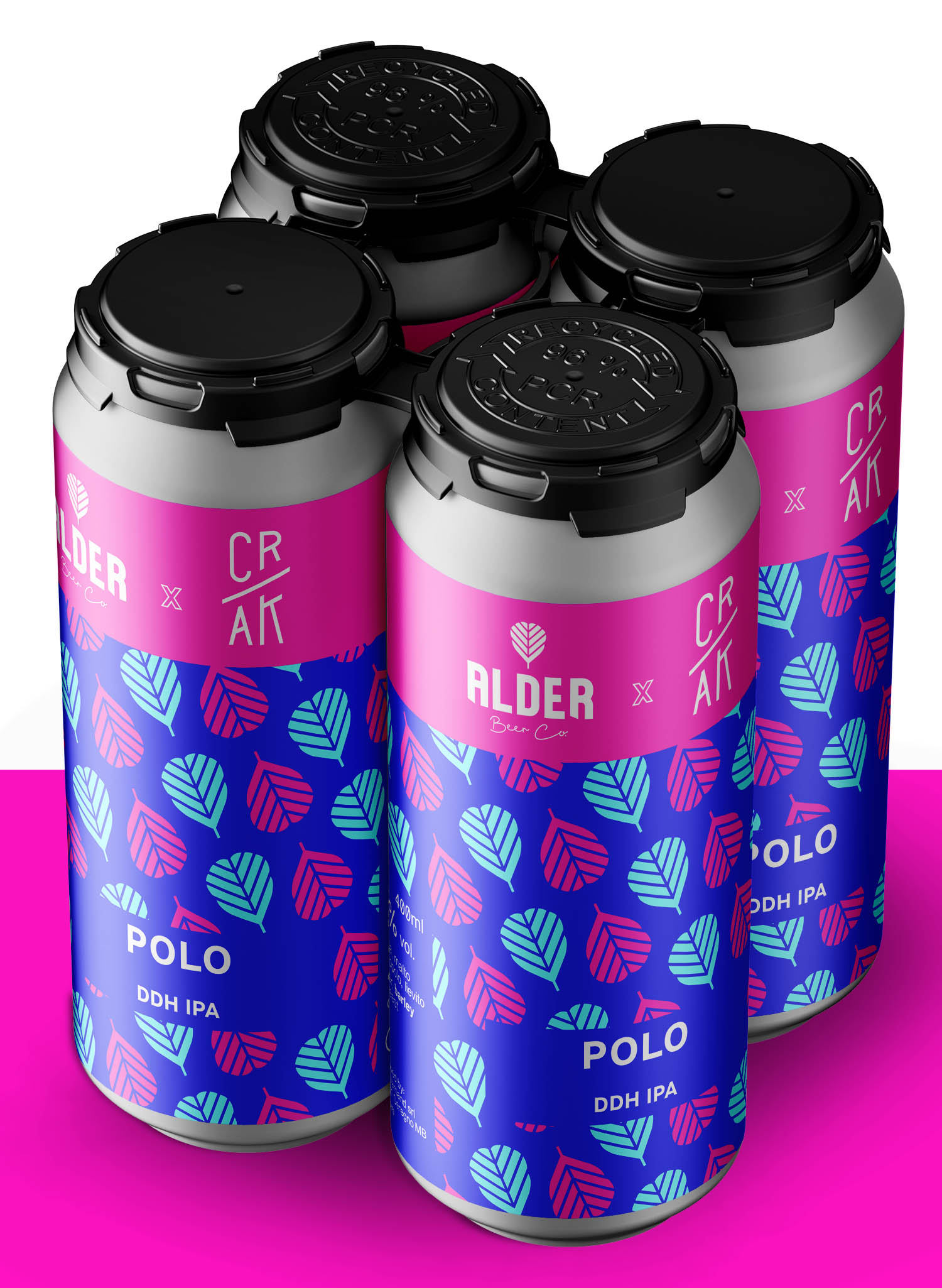
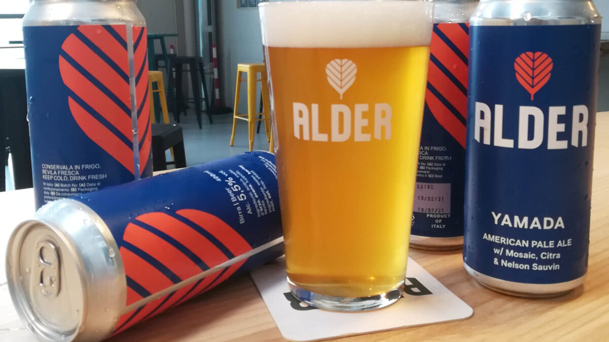
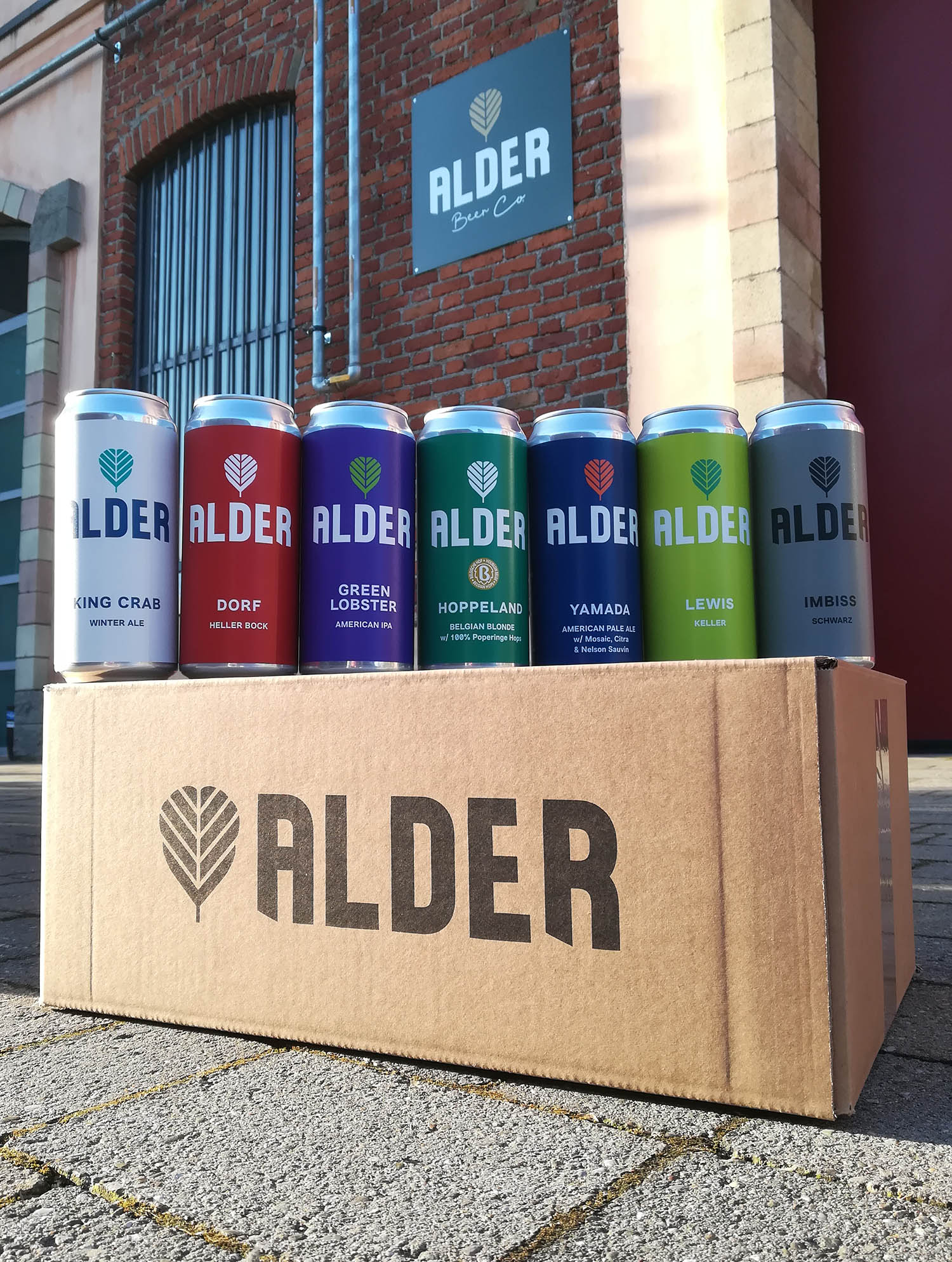
The brewery business is focused on an ever rotating offer, with new and one-off beers released on a tight weekly schedule and sold directly from their busy taproom. The choice of 400ml cans gave us a large scale canvas to work with, and the briefing was to create a visual system that enhanced the mother brand and featured contrasting colours for SKU differentiation.
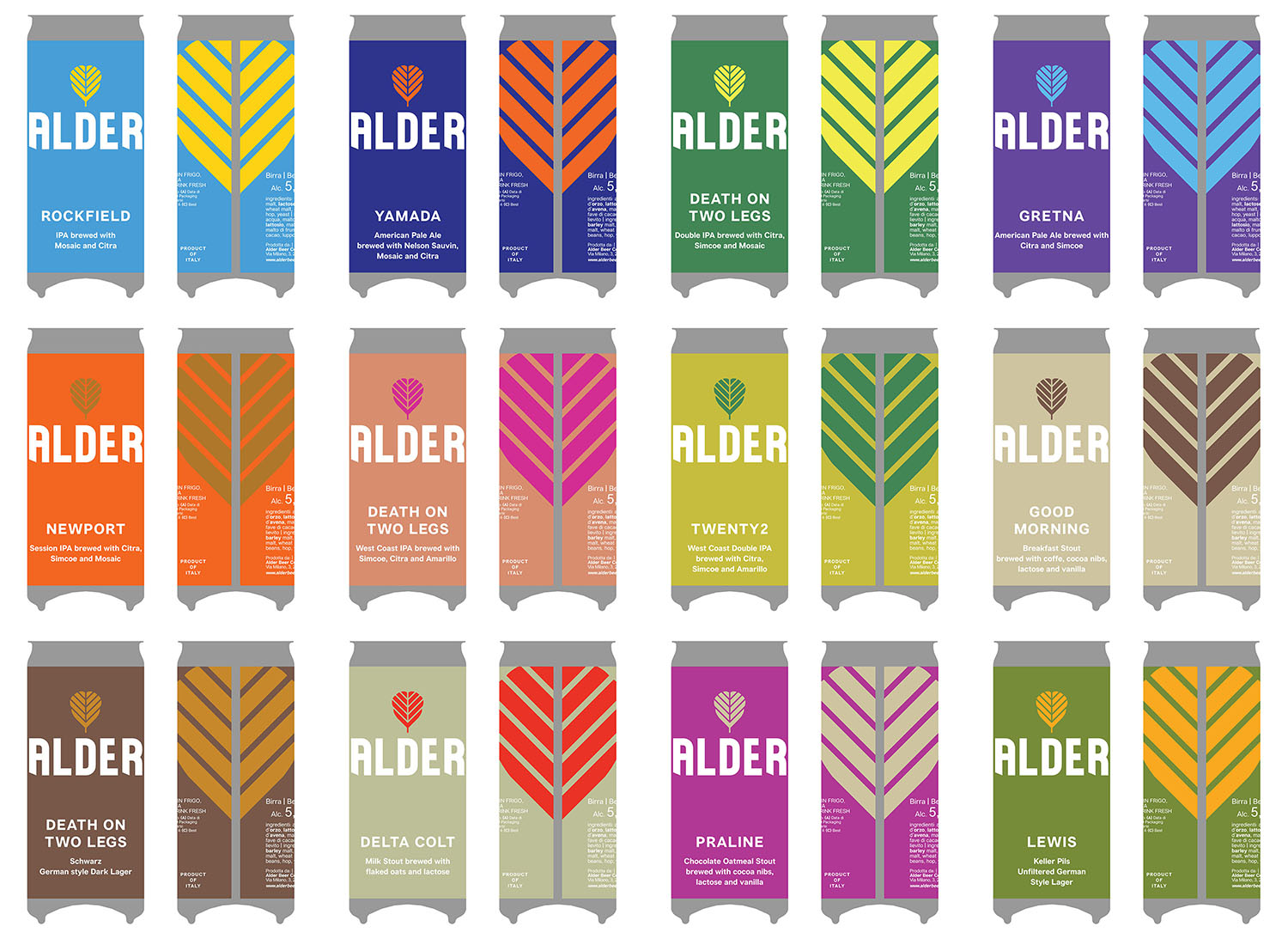
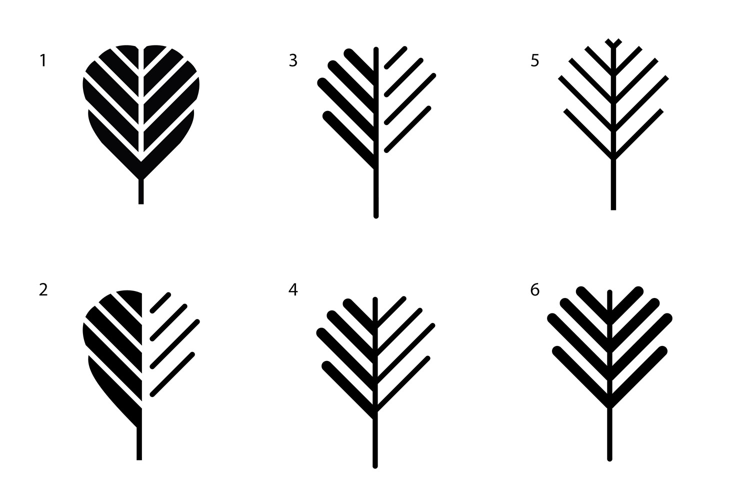
The logo consists of a bold capital lettering with a street style paired with a graphic synthesis of the alder leaf. On pack, a scaled alder leaf becomes a distinctive feature at the back of the label, enhancing the brand awareness. The dynamic portfolio is supported by a broad colour palette of luminous shades that creates highly memorable colour pairs that stand out on shelf. The clean minimalism and purity of the labels invites the beer to do the talking, leaving airy space for only key information like the beer names, styles and distinctive features.
